

We decided to cannonball rather than dip a toe.
Midcentury House — an ultra-modern, high-contrast home on Lake Texoma, and an aesthetic nothing like my own.
Scroll
The brief
The owners of this home wanted something bold — genuinely modern, high-contrast, the kind of house you don’t see much out here on the lake. For a while they went back and forth about how far to push it, which is a conversation I have on a lot of projects.
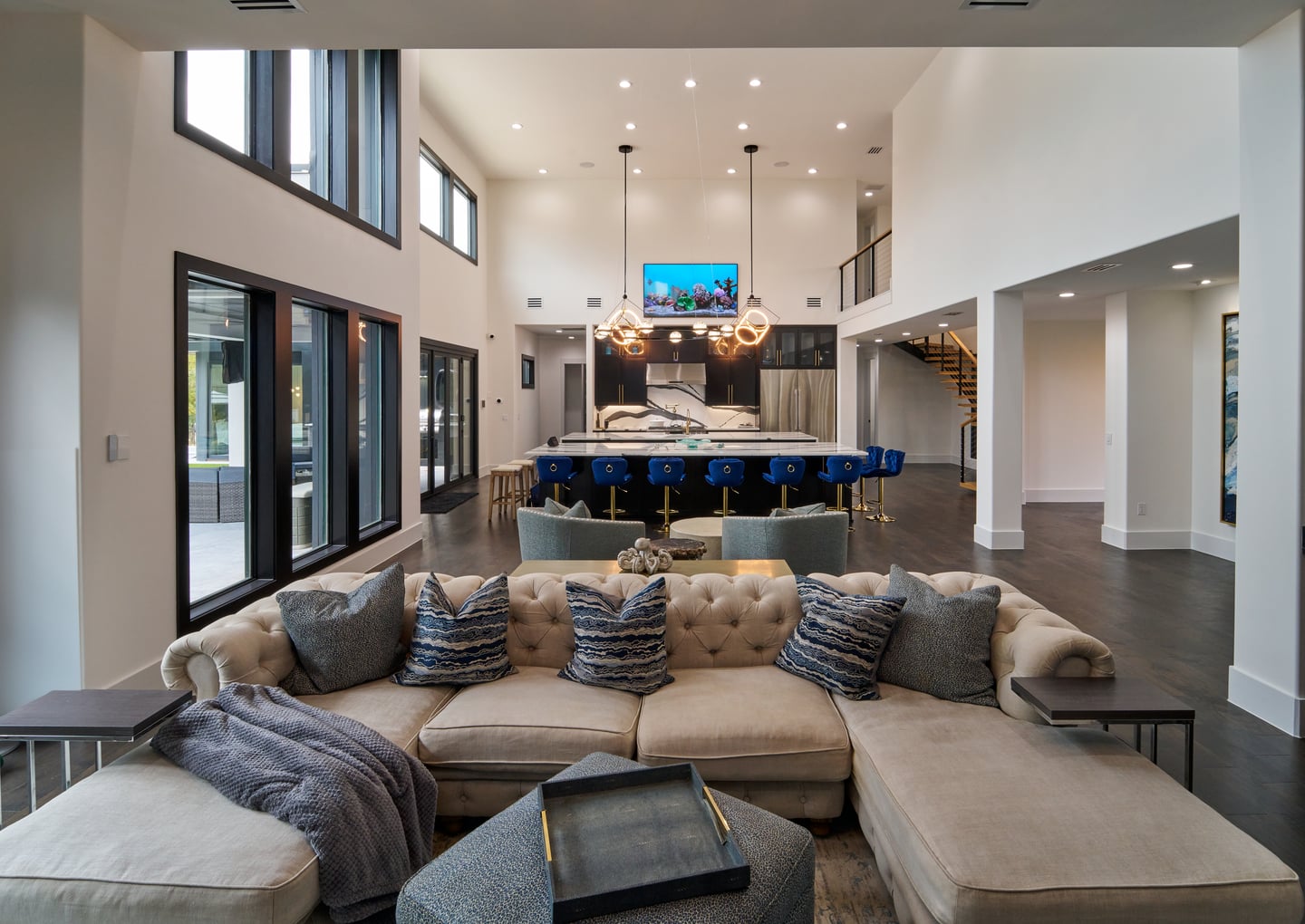
In the end we decided to cannonball rather than dip a toe. We went all the way modern, with a spare palette of blacks, grays, whites, and
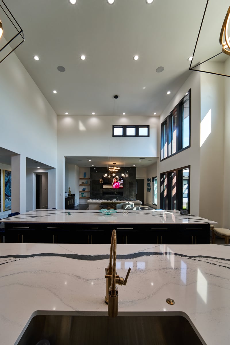
creams — kept deliberately quiet so the furniture, the light, and the art could become the statement. A high-contrast stone slab even gets to act as a piece of art in its own right.
This is my favorite kind of challenge, honestly: morphing into an aesthetic that’s nothing like my own and getting it exactly right for the people who’ll live in it. It’s a big part of how I think about every home.
We kept it deliberately quiet, so the furniture, the light, and the art could become the statement.
A blank canvas
Going this modern only works if the shell gets out of the way. So I treated the whole palette as a blank canvas — blacks, grays, whites, and creams, high-contrast but quiet — and let the pieces that move in do the talking. The stone I chose is high-contrast enough to read as art on its own.
That restraint is a choice, not an absence. Getting a palette this spare to still feel intentional is some of the most careful color work I do.
Grounding all that light
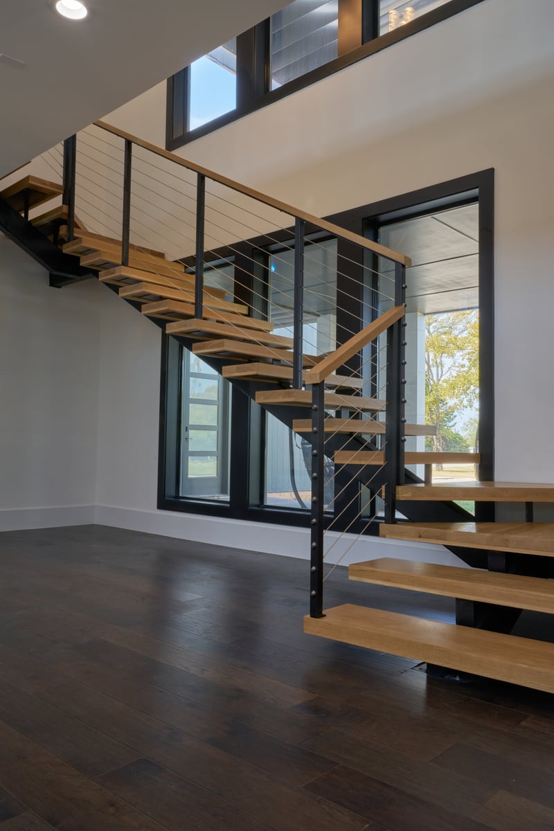
With two full stories of windows and thick black frames everywhere, this home gets a tremendous amount of light — beautiful, but a real design problem. Left alone, all that brightness bounces around and flattens everything, and the black frames start to feel disconnected.
So I took the floors several shades darker than we’d originally picked. That one move grounds the whole space, keeps the light from ricocheting, and ties all that black framing together, so the composition finally reads as one deliberate thing. It’s the kind of decision you only make if you’ve spent time watching how light actually behaves in a room.
Inside and out, of a piece
The thing I’m proudest of here is that the home makes sense from every direction. It’s a showstopper from the road — genuinely arresting, and unusual for the area — and, unlike a lot of striking exteriors, the inside doesn’t let you down when you walk through the door.
That coherence is harder than it looks. When a bold exterior gives way to an interior that has nothing to do with it, you feel the disappointment immediately. Here, the outside and the inside are telling the same story, which is the whole point of a home this committed.
How it turned out
What we landed is exactly what the owners were brave enough to ask for: an ultra-modern, high-contrast home that stops you from the road and holds up all the way through. It’s unusual for the lake, and I love that it is.
It’s also the clearest proof I have of something I believe — that a home doesn’t have to look like its designer to be right. This one is nothing like what I’d build for myself, and getting it exactly right for the people who wanted it is precisely why I’m proud of it.
Like all my homes, this one is a Ceci Bates build — Roberth Jordan’s architecture, built by our crew — and the palette, the materials, and the way it all comes together are the part that’s mine. See it from the builder’s side →
Ready to cannonball?
If you’ve been wondering how far you can push a modern home — and whether you should — I’d love to talk it through. Sometimes the boldest version is the right one, and it helps to have someone who has done it before. Tell me what you’re imagining; there’s no pressure, just a conversation.
Tell me about your vision